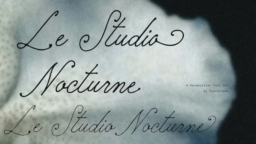
WE AND THE COLOR
Seriously, your resume is a design artifact. As a creative professional, it is simultaneously your introduction, your proof of concept, and your first portfolio piece — all before a hiring manager reads a single bullet point. So why would you hand that responsibility to an AI text generator or a generic word-processor template? The best […] The post 5 Best Adobe InDesign Resume Templates in 2026 …
CarmineType’s Soleá Is an Elegant Typeface for Luxury Branding Typography enthusiasts often blindly trust foundry classifications. Therefore, we miss crucial structural details. CarmineType categorizes the Soleá typeface as a modern sans serif. However, I fiercely disagree with this official label. Look closely at the terminal points. Consequently, you will spot subtle, whispering serifs. Indeed,…
A business card still does something a digital profile cannot. It transfers weight, texture, and intention from one hand to another. That tactile moment carries meaning — and designers know it. But before a card goes to print, the presentation matters just as much as the design itself. A clean, high-resolution business card mockup lets […] The post This Business Card Mockup for Photoshop Makes Yo…
The Porito Font Family Is the Art Deco Typeface That Makes Retro Feel Inevitable Geometric typography is having a moment — and not a quiet one. Brands are actively walking away from the sterile neutrality of neo-grotesque fonts and reaching back toward something with visual conviction. The Porito font family lands right at that inflection […] The post Porito Font Family by Nasir Udin appeared fir…
Here’s Your Complete Guide to the Best Video Editing Software in 2026 for Professionals as Well as Beginners and Hobbyists—Plus the Best Free Alternatives Available Right Now. We expect technology to serve our creative vision instantly and seamlessly, but finding the best video editing software in 2026 requires entirely fresh industry perspectives. Without sacrificing their […] The post The Favor…
This post contains affiliate links. We may earn a commission if you click on them and make a purchase. It’s at no extra cost to you and helps us run this site. Thanks for your support! Graphic designers often start a magazine project the same way — a blank InDesign document, a ruler, and a quiet panic about the deadline. Tom Sarraipo decided that was unnecessary. His fully customizable Adobe InDe…
I think that most wine labels try to seduce you with a pretty picture. A vineyard at sunset. A coat of arms. A stylized animal that looks like it was licensed from a stock illustration library. The Pink Pelican Srebarna Rosé label design by Foxtrot Studio does none of that — and that’s exactly why it matters. This is a wine label design as landscape architecture. It’s physical, conceptual, and qu…
This post contains affiliate links. We may earn a commission if you click on them and make a purchase. It’s at no extra cost to you and helps us run this site. Thanks for your support! Oh Boy, Hand-Drawn Typefaces Are Having a Major Moment, and These 5 Fonts Prove It! Something changed in type design. Not quietly — boldly, and with visible ink pressure. The hand-drawn typefaces released in early …
This post contains affiliate links. We may earn a commission if you click on them and make a purchase. It’s at no extra cost to you and helps us run this site. Thanks for your support! I think that your resume is a design artifact, but most people treat it like a form to fill out — and that is their first mistake. A resume and portfolio presentation layout is not a formality. It is an argument. I…
This post contains affiliate links. We may earn a commission if you click on them and make a purchase. It’s at no extra cost to you and helps us run this site. Thanks for your support! The white t-shirt is the most deceiving object in graphic design. It looks simple. It looks neutral. But every brand, every streetwear label, every independent designer knows the truth: the presentation of a design…
Beauty isn’t a mystery. It’s a calculation — one your brain runs in milliseconds, without asking for your input. You glance at a logo, or scroll past an image, and something registers immediately. You either feel drawn in or you don’t. That instant pull is the psychology of visual aesthetics at work. And it’s far more precise, more predictable, and more powerful than most people realize. This mat…
This post contains affiliate links. We may earn a commission if you click on them and make a purchase. It’s at no extra cost to you and helps us run this site. Thanks for your support! The kind people at Skylum sent me early access to the beta versions of Luminar Neo and the newly renamed Luminar app — and I’ve spent the past few days testing both ahead of the official April 9 launch. It was my f…
This post contains affiliate links. We may earn a commission if you click on them and make a purchase. It’s at no extra cost to you and helps us run this site. Thanks for your support! The Galdertin Charetam Typeface Shows What a Serif Font Family Can Actually Do Typography shapes how people feel before they read a single word. The right typeface sets tone, signals intent, and communicates values…
This post contains affiliate links. We may earn a commission if you click on them and make a purchase. It’s at no extra cost to you and helps us run this site. Thanks for your support! Honestly, most project proposal presentations fail before anyone reads a single word. They fail at the layout stage — cluttered grids, mismatched type scales, no visual hierarchy to guide the eye. Clients tune out.…
This post contains affiliate links. We may earn a commission if you click on them and make a purchase. It’s at no extra cost to you and helps us run this site. Thanks for your support! The Butter and Crumb Font Duo Shows That Imperfection Is Currently the Boldest Design Choice. Some typefaces behave. Butter And Crumb does not — and that is its entire point. Nicky Laatz released this font duo as a…
Something changes when you stop treating light as the only goal. Most cottage renovations chase brightness — white walls, exposed beams, linen curtains, every cliché you’ve seen a hundred times on Pinterest. Plus One Architects did the opposite. Their attic conversion of a 19th-century farmhouse in the Czech Vysočina region builds atmosphere through shadow, raw material, and deliberate restraint.…
This post contains affiliate links. We may earn a commission if you click on them and make a purchase. It’s at no extra cost to you and helps us run this site. Thanks for your support! Honestly, nostalgia is not just a trend. It is a design language — one that communicates trust, craft, and character faster than any modern typeface ever could. Retro logo illustrations have dominated branding conv…
This post contains affiliate links. We may earn a commission if you click on them and make a purchase. It’s at no extra cost to you and helps us run this site. Thanks for your support! Something fundamental shifted when designers stopped asking “Will AI replace me?” and started asking “What can I do now that I couldn’t before?” That shift — quiet, undramatic, but enormously significant — is what …
This post contains affiliate links. We may earn a commission if you click on them and make a purchase. It’s at no extra cost to you and helps us run this site. Thanks for your support! The Pants On Fire Font Shows Why Handcrafted Typography Is Trending Right Now! Some fonts whisper. The Pants On Fire font by Hanoded speaks at full volume — and then pulls up a chair and stays. Designer David Kerkh…
research.ioSign up to keep scrolling
Create your feed subscriptions, save articles, keep scrolling.