


The nuclide chart is a staple of nuclear physics, visualizing the properties of nuclides arranged by their number of protons and neutrons. The chart appears in text books, talk slides and Lego™ form (in the Binding Blocks science outreach programme). The 3D Nuclide Chart is a web app put together by Ed Simpson (@SuperSubatomic on Twitter) of the Australian National University. The app lets users plot the nuclear data of their choosing (taken from published data tables), play around with the 3D viewpoint (or work in 2D), set colour schemes and fonts, and then export the visualization as a png file or export the relevant data. The results are rather pretty, and the app is easy to use. Read more Continue reading →
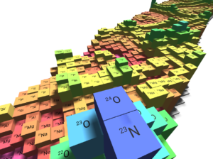
Interactions: Ed Simpson and the 3d nuclide chart
Zoe Budrikis