
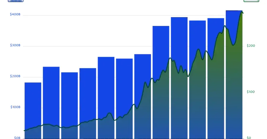
Financial charts often combine metrics that live on completely different scales. For example: company revenue measured in billions of dollars, stock prices measured in tens or hundreds of dollars. I wanted to recreate the infographic style seen on Visual Capitalist using pure Python and SVG. The chart combines: annual revenue as bars, monthly stock prices as a line, a secondary axis, a clipped gradient area inside the revenue columns. One of the most interesting parts is the clipping effect. The
Build a Revenue and Stock Price Combo Chart with Python
Marek