


The wordmark White type on black — the classic case. The whites are selected automatically. glows: whites Original artwork, converted with this tool. Drag the handle; on an HDR display in a capable browser the right side glows. “Use this” loads the original into the tool above. A white ring plus one brand color. Whites and the blue are both pushed to the same peak. glows: whites + #2f6bff Cream type on dark teal — not white, so it's picked as a color. Light elements on dark backgrounds glow best. glows: #f5e9c8 Your JPEG stays a normal JPEG. For the web we add an ISO 21496-1 gain map — a second, tiny grayscale image that tells HDR-aware software how much brighter each pixel may go. For LinkedIn we write the pixels in BT.2100 PQ with the matching ICC profile, which LinkedIn preserves. Light, near-white elements on dark backgrounds. Strong (+2.9 stops, ~1,500 nits) is the measured real-world sweet spot. Dark colors can't really glow — boosting them reads as washed neon. HDR only shows on HDR displays in software that honors gain maps or PQ profiles (Chrome, Safari 26, Apple Photos, LinkedIn's apps). Most other platforms strip or normalize it — the file still looks perfectly normal there.
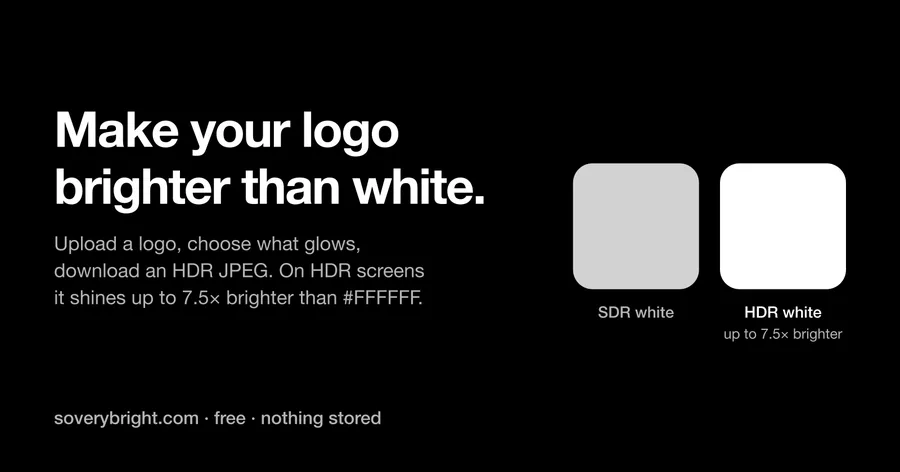
Show HN: Make your logo extra bright on HDR screens
Chris Bennett
2 min read