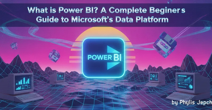
Series: 30 Days of Power BI | Day 1 of 30 Level: Beginner | Read time: ~8 minutes You've heard the term. Now let's make it click. If you've spent any time around data, analytics, or business intelligence, you've probably heard someone mention Power BI. Maybe your manager asked for a "Power BI dashboard." Maybe you saw it on a job posting. Maybe you're just curious what it actually does . By the e…
When we talk about Data Visualization and Dashboards, enterprise tools like Tableau or PowerBI often dominate the conversation. However, for Data Scientists and Developers, these GUI-based tools can feel restrictive. What if you need complex machine learning integration, custom UI logic, or automated CI/CD deployments? Enter the holy trinity of Python visualization tools: Streamlit, Dash, and Bok…
Every chart you have made so far is dead. You save it as a PNG. You look at it. You wonder what that one outlier point is. You squint at the axis. You cannot zoom in. You cannot click anything. You cannot hover to see exact values. You make a new chart with different settings. Save again. Look again. This loop is fine for quick exploration. It becomes painful when you have a complex dataset with …
Transforming geospatial textual data into narrative storytelling visualization
Ma, Ruixian
Current large language models (LLMs) often struggle to integrate geospatial data into dynamic, interactive visualizations, relying instead on text-based outputs. This limitation hinders the full potential of geospatial data to convey complex information through narrativedriven communication, making it diffi…
Registration Deadline: February 1 Register NOW Do U Love Data? Join the Data CommUnication Challenge for Love Data Week! If you think you can turn data into a story that captivates and informs audiences, we want to see it! Marking the end of Love Data Week, the Data CommUnication Challenge invites undergraduate and graduate students […]
What you'll learn:
- Introduction to Tableau
- Data visualization
- Data connections
- Mapping and geospatial analysis
- Advanced analytics
- Publishing and sharing
Course offers:
- We offer one-on-one or group tutoring sessions in a variety of subjects.
- Experienced tutors who provide personalized instruction and guidance.
- Interactive virtual classrooms with video and audio communication.
- A…
Rapid advancements in Artificial Intelligence have instigated introspection
across the data visualisation field. Though swathes of AI discourse are
characterised by hype and gimmickry, if you cut through the noise, it’s
clear we are facing a significant new era of technological progress. It’s
time to evolve, or die, as the saying goes. But what should our
relationship with AI be, particularl…
Will conversational interaction replace SQL queries, KPI reports, and dashboards? The post Natural Language Visualization and the Future of Data Analysis and Presentation appeared first on Towards Data Science .
An explanation of time-series visualization, including in-depth code examples in Matplotlib, Plotly, and Altair. The post Data Visualization Explained (Part 5): Visualizing Time-Series Data in Python (Matplotlib, Plotly, and Altair) appeared first on Towards Data Science .
Author: Caroline Baker DimockDate: 11.05.25 Lace Padilla, an assistant professor in the Khoury College of Computer Sciences and the College of Science’s Department of Psychology, has been awarded the Institute of Electrical and […] The post Lace Padilla wins VGTC research award for studying uncertainty in data visualization appeared first on Khoury College of Computer Sciences .
A brief introduction to data visualization and its importance in today's technological landscape. The post Data Visualization Explained: What It Is and Why It Matters appeared first on Towards Data Science .
How research-backed color principles improved clarity and storytelling in my dashboards The post The Crucial Role of Color Theory in Data Analysis and Visualization appeared first on Towards Data Science .
A waterfall chart can be a powerful tool for conveying information. But it has some limitations. The post On Adding a Start Value to a Waterfall Chart in Power BI appeared first on Towards Data Science .
What’s the difference between simply displaying data and creating a compelling data narrative? How can you transform raw numbers into a story that resonates with your audience and drives meaningful action? Cole Nussbaumer Knaflic’s Storytelling With Data: A Data Visualization Guide for Business Professionals reveals that effective data communication isn’t about creating complex visuals. It’s abou…
What if you could present complex data without overwhelming your audience? How can you effectively use multiple data sets to tell a compelling story? In her book Storytelling With Data, Cole Nussbaumer Knaflic explains that our brains have limited visual processing capacity, making it crucial to present multiple data sets thoughtfully. She offers three core principles that help reduce cognitive l…
What’s the best way to make sense of those spreadsheets filled with thousands of numbers? How can you understand data in a way that helps you explain it to others? In her book Storytelling With Data, Cole Nussbaumer Knaflic teaches readers how to interpret data by focusing on two essential skills. She offers practical techniques to transform complex information into clear, compelling visuals that…
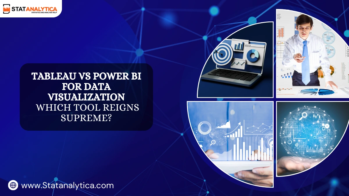
Tableau and Power BI are the two most commonly used data visualization tools, with both offering distinctive functionalities to transform data to help businesses gain insight from raw data to usable and meaningful information. So, suppose you are a business analyst, data scientist, or an individual interested in utilizing data to make informed and data-driven decisions. In […]
In this technologically advanced era, data and information are an essential part of every institutional and constitutional activity. Trillions of charts, graphs, maps are used to make data, and a vast amount of data makes information. To analyze every information, data visualization tools are essential by which one can find out patterns, layers, and the […] The post 20 Best Data Visualization Too…
How can authorities make the best use of rescue boats in the aftermath of a serious storm? Can airport security screenings be faster and safer if it’s easier for transportation workers to spot threats on their screens? Will good maps help experts understand where to send vital resources in emergency situations? Today, lawmakers and leaders must make big decisions, and they must often do so very q…
In today’s data-driven world, understanding and visualizing data is crucial for making informed decisions in business and beyond. Two popular tools for data visualization and business intelligence are Looker and Tableau. Let’s explore these tools (Looker vs Tableau) in a way that’s easy to understand. Overview: Looker and Tableau Looker and Tableau are both powerful […]
computer-sciencedata-visualization
research.io
Sign up to keep scrolling
Create your feed subscriptions, save articles, keep scrolling.